One of the challenges in bringing a complex, rich text app to iOS is how to provide quick access to a tonne of features on a small screen. Things aren’t so difficult on an iPad Pro, where there is lots of screen real estate, but on an iPhone, space is at a premium.
Another challenge is how to provide a frictionless writing experience with an on-screen keyboard. We’ve been able to add loads of keyboard shortcuts for those using external keyboards, and an external keyboard makes it much easier to navigate through text (using the arrow keys). But what if you don’t have an external keyboard handy?
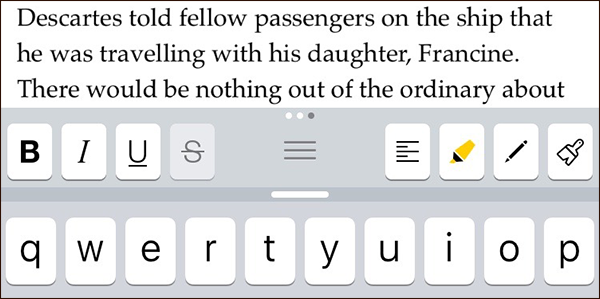
These challenges have been met with the extended keyboard row: a row of eight buttons that sits across the top of the keyboard (which can be turned on or off). These buttons provide quick access to common commands.

Not just eight buttons: in fact, there are twenty-four, divided into three sets that you can swipe between. By default, there is one set containing common punctuation marks, another to make text selection and navigation easiser, and another for formatting commands such as bold, alignment, highlights and footnotes.
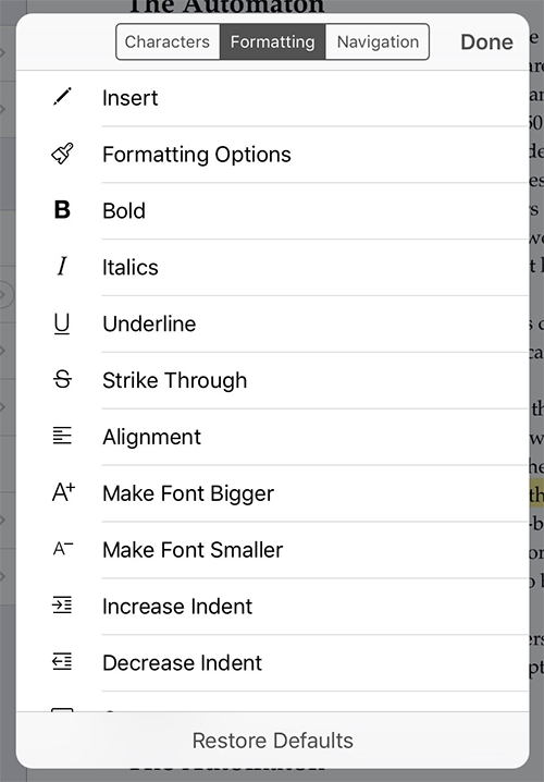
The keyboard row is fully customisable—long tap on any button to bring up a list of commands that are available. Tap one to replace the button you long-pressed with the command you selected.

Along with the extended keyboard row, Scrivener for iOS also supports smart punctuation, so you get curly quotes, ellipses for triple-periods, and em-dashes for double-hyphens automatically as you type (unless you turn smart punctuation off via Settings app).
Scrivener for iOS has a whole raft of cool features that will help you organise your work and refer to research—but at its centre we have worked hard to provide a beautiful writing experience.

