Some suggestions for the corkboard

The corkboard is one of my favourite features in Scrivener. Here are a few suggestions to make it even better.

Scrivener is very customisable. This is good news for a program you’re likely to spend a lot of time in. The problem is, the options seem a bit… scattered. The corkboard, for example, is customised in 4 different places; the corkboard preference panel, the colour section of the appearance preference panel, the corkboard submenu of the view menu and the small corkboard options pop-up panel at the bottom right of the corkboard. Would it be possible to keep the customisation options for the corkboard in fewer places?

I couldn’t find the option to show keyword colours as chips on each card, I just happened upon it while searching for something else. You can already set the number of keyboard chips to display on each card, in the corkboard options pop-up panel. Adding the option “None” to the list would make it a lot easier to find, and wouldn’t even take up any screen space. It would also make it impossible to set “Keyword chips” to 5 and still not see any chips, something I initially thought was a bug.

The label of each card is shown by the small coloured square in the top right corner, but when you have many cards and many keyword chips on each card it doesn’t exactly stand out. It would be much easier to get an overview of the labels if the colour of the label was used for the title or maybe even the whole card.

The freeform corkboard is excellent for getting your different ideas in order, but it would be nice to be able to group different cards together by dragging one next to another and have it automatically snap into place. This would also stop me from wasting time trying to align the cards just right, and instead force me to find better ways to procrastinate. Or write something. Whichever seems possible at the time.

I’ve posted a version with screenshots here.

I think part of the problem here is that you are lumping together view toggles with preferences. Whether or not to show keyword chips is not a preference—rather it is a project specific setting. You may want that in one project but not another. If it was set up in preferences you would no longer be able to customise your projects in accordance with what they needed to display. Same of course goes for pins and stamps.

Now, the palette in the footer bar is a level below even project specific. That is split specific. Each split view can have its own view settings at this level. If you lump everything together, you either end up with too many options at the split level, or a loss of flexibility by making stuff global that shouldn’t be global. How to handle card wrap is very split-centric because one split might be a single card wide, while another is 30 cards wide. You wouldn’t want the same setting for both! Moving something like keyword chips to the palette would mean turning off keyword chips completely now requires you to open up a split if necessary, change the view mode to corkboard in both, and disable it in both splits.

So while it makes a kind of sense to put “None” in the number of keywords drop-down, this would in effect cause greater issues elsewhere.

Stepping back a bit to the larger issue and away from the details: Yes, there are a few places you have to visit to set up the corkboard, but the question is: do most people visit all four of these places on a regular basis?

I think the answer to that question is no. I think once people fiddle with things and find some comfortable colours and workflows, they largely never visit the colour section in Appearance, or change aspects in Corkboard. I know I certainly played with preferences a lot when they first appeared, but now that I’ve been using 2.0 for ages—I never adjust anything unless I’m experimenting with a reported bug or something.

For actual work, I have things set up the way I like them and that is pretty much how they stay. So the “four places” problem really seems to be more of a “two places” problem in the long run and given the problems with grouping these two together as detailed above, I’ve never had cause to gripe with it—especially since many of the project specific settings have keyboard shortcuts. I do actually turn keyword chips, stamps, and pins on and off quite a bit—but I always use the shortcuts for that so never even really think of them as being in “another place”.

For me, the several places are organised in terms of frequency of change and relevancy of scope. The specifics of how cards are laid out in a corkboard—that something I change quite a lot, maybe even whenever I adjust a split size by a fair bit. These tools are handy and accessible and don’t mess up my other corkboard when I access them.

Meanwhile the stuff I change generally once when I set up the project are all located in menus. The few things in these menus I flip on or off more frequently have shortcuts so that’s fine.

The rest—I never touch that stuff save but for once every six months when my mood changes. I’ll go from dainty and pastel to brooding leather and wood panelling or something. Spreading them out means no one area is unduly cluttered with stuff that you rarely use. To change how many cards show up in a row, you don’t have to pick through 50 controls of things you never alter.

If you don’t like the look of it, you could try going back to the more analogue look, which uses a pin for the label colour instead of a colour chip. The rounded card look is rather meant to have a more seamless design and it will be conducive to people who use keywords as “multiple labels”.


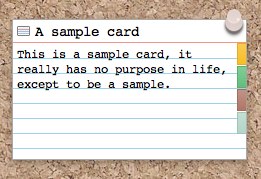
[size=80]Theme: Red and Blue Lines; Pin on right[/size]

Or, if you want a more obvious label colouring mechanism, try turning of the right-side chip and setting label colour to tint the entire index card. This basically does exactly what you ask for above.


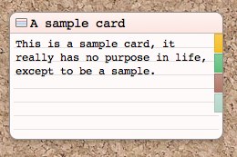
[size=80]Theme: rounded; Pins off; Label colour in index card[/size]

I have no comment on snapping. I don’t think that’s a bad idea, so long as the magnetic area isn’t too large (some people like the analogue helter-skelter look, by the way, so you wouldn’t want free-form to end up effectively enforcing a grid)—however that might be difficult to actually implement and that sort of thing is up to Keith anyway.

Forgot to mention one other tool. If you do find yourself using project level preference more like application level preferences (in other words, you set up your projects to look a certain way using the menus, every single time and never deviate from that), then that is an excellent candidate for creating your own blank project template starter.

And if you’re doing that, you can set the opacity of the color via Preferences:Appearance, so you can make it darker/brighter to stand out more if you prefer.

Wow, that is very long and thoughtful response. Thank you for that.

Now I agree we need to separate between global preferences, project settings and view settings. But I can definitely imagine wanting to show the keyword chips in one corkboard but not another, something moving the setting to the pallette would allow. I guess this is more down to personal preference than anything.

You are right most people don’t use these settings very often so this isn’t a big problem. But it is a slightly bigger problem that I had no idea it was even possible to set the card colour to the label colour, because that setting was not in any of the four places where the other settings for the corkboard are. And, at least to me, those are the only places it makes sense to look.

Don’t get me wrong though, to organise so many settings in a way that satisfies all users must be, to borrow a phrase, “the art of the impossible”.

That’s actually not a bad point. The only counter-point I can see to that is that if you allow a “0” or “None” option to override the project default in one split, that could lead to support issues along the lines of “Why don’t my keyword colours work any more”, where one forgets they have made that setting change. It’s a small point, but lots of decisions along these lines boil down to that crucial question: Will this feature cause confusion at a significant enough level to warrant not implementing it.

Again, Keith might pop by and say it’s a good idea; he might not. :slight_smile: We’ll see.

To say the least! You probably have no idea how much discussion and consideration each slider and checkbox has had with this program; to a pathological level some might say. Ha. Here is the logic behind why it is in that sub-menu and not the corkboard sub-menu:

  1. It keeps all of the label tinting options together. Some of these would not reasonably fit in anywhere else other than in one spot together like this (where would icons go, for instance, since icons appear everywhere). It makes one place to go to if you want to use label colour to impact the visual appearance of your project. Corollary to this, if you split these apart, your same argument for grouping everything that impacts the corkboard into one menu would apply in inverse: now if you want to set up label tinting in your project, you have to hunt all over the place to find where each individual option was buried. So moving them wouldn’t actually solve your problem universally, it would just shift it to another place.
  2. The tinting is being applied to index cards, not the corkboard. It might seems like splitting hairs, but consider that the index card doesn’t just appear in the corkboard, it also appears in the Inspector, and it will be tinted there as well when this option is engaged. In the future, there might be other places the index card is used as well, so in conjunction with point #1, it makes the most sense to keep this abstracted since one foot is already through the door anyway, with the inspector.

Art of the impossible, indeed.